Eszter's Slide Presentation Tips and Tricks Page
|
>> Don't start a slide show without it! <<
The following are tips to make your slide presentations -
e.g. PowerPoint slides - better in the future by making them more
readable.
Tips for making slides better
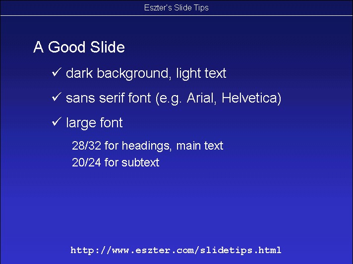
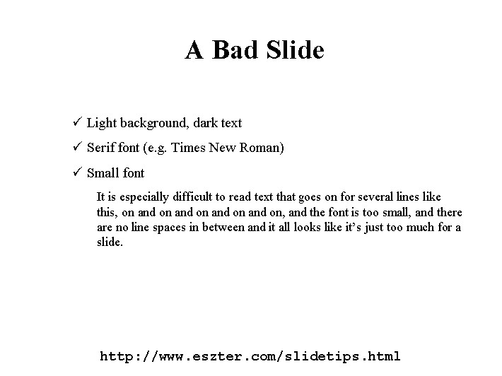
Use dark background with light text. (Although note
that if you are presenting in a bright room, it
may be easier to see a slide with a light background. Thanks to Lorrie
Cranor for pointing this out to me.)
Use sans serif font such as Arial or Helvetica. (For example,
do not use Times, it's harder to read in a distance.)
Use large font, never as little as 12 point.
When displaying data (findings via
numbers or quotes) consider using a different font, e.g. Courier bold, for
emphasis. And although Courier is not sans-serif, it is big and bulky and
can be read from afar.
If you can barely fit it on the slide then it's too much material.
Unless everyone in the room can see all the details, get rid of some of
the information. You don't want people to be distracted by squiting and
trying to guess what's on your slides.
Minimize distractions. Do not display too many graphics and be very
selective with the use of animations.
Remember the importance of white space, or perhaps we should just call
it "blank space". Leaving some space on the slide blank is very important
to making it an accessible slide.
If you have a lot to say, consider writing bullet point words instead
of sentences or split up the slide's content into two slides.
Compare the following:
Back to Eszter
Hargittai's
Homepage
Last updated: Summer, 2006
http://www.eszter.com/slidetips.html
|